Linear Regression and Correlation: Does That Trend Line Actually Mean Anything?
Four datasets can share the same regression line, R-squared, and correlation — and look nothing alike when plotted. Why you can't trust the number alone.
Linear Regression and Correlation: Does That Trend Line Mean Anything?
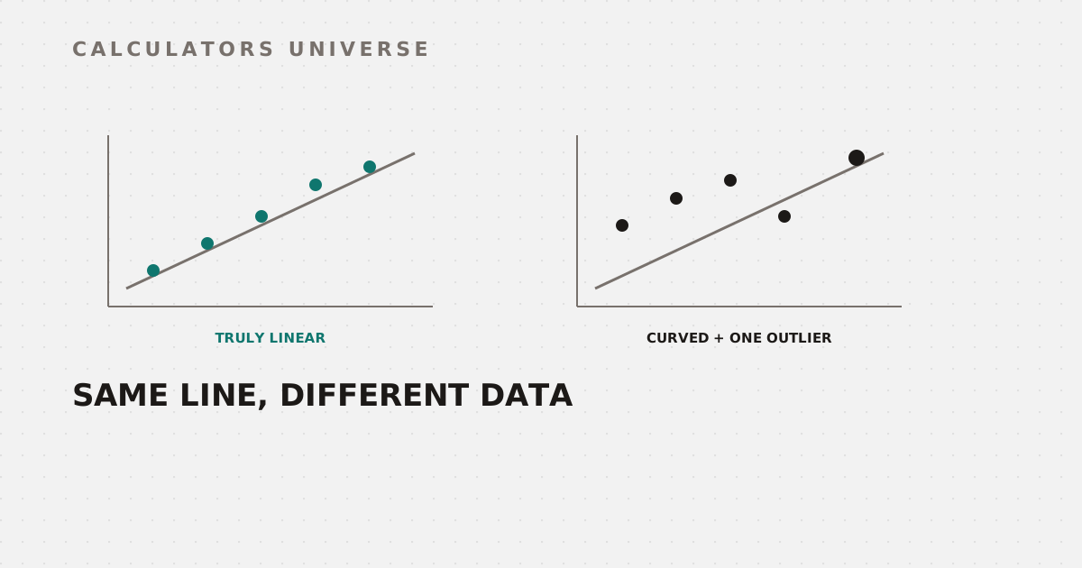
In 1973, statistician Francis Anscombe published four datasets with identical means, identical variances, an identical correlation coefficient, an identical R², and an identical regression line — and when actually plotted, they look nothing alike. One is genuinely linear. One is a clean curve. One has a single outlier doing all the work. This is the real reason a trend line’s summary numbers can’t be trusted without also looking at the data itself.
Linear Regression: Fitting the Best Line
Linear regression finds the straight line that minimizes the total squared distance between itself and every data point — the least-squares method. The result is a slope, an intercept, and a predictive equation. Fit a least-squares regression line from your own x, y pairs — with slope, intercept, R², residuals, and a scatterplot — using the Linear Regression Calculator.
R²: How Much of the Story the Line Actually Tells
R² (the coefficient of determination) measures the proportion of variance in y that’s explained by the regression line: R² = 1 − (SSE/SST). An R² of 0.85 means 85% of the variation in the outcome is accounted for by the model — it does not mean the model is “85% accurate,” a very common misreading. The remaining 15% is variation the line simply doesn’t capture.
Pearson Correlation: Strength of the Linear Relationship Only
The Pearson correlation coefficient, r, ranges from −1 to +1 and measures the strength and direction of a specifically linear relationship between two variables. For simple linear regression, r² and R² are the same number — correlation and regression are two views of the same underlying relationship. Calculate Pearson r, r², and covariance with a scatter plot using the Pearson Correlation Coefficient Calculator.
Anscombe’s Quartet: Why You Must Actually Look at the Data
Here’s the demonstration that makes the danger concrete. Anscombe constructed four (x, y) datasets, each with 11 points, engineered so that every standard summary statistic — mean, variance, Pearson correlation, R², and the fitted regression line itself — comes out identical across all four. Plotted, they reveal completely different structures: one is a genuinely linear relationship, one is a clear curve that a straight line badly misrepresents, and one is a perfect line thrown off by a single outlier that, if removed, would completely change the picture.
Same mean, variance, correlation, R², and regression line — genuinely different underlying relationships
The takeaway Anscombe intended has held up for over 50 years: always plot your data before trusting the summary statistics alone.
Correlation ≠ Causation: The Real (and Ridiculous) Proof
Beyond shape, there’s a separate trap: even a strong, statistically real correlation doesn’t imply one variable causes the other. Researcher Tyler Vigen built an entire project, Spurious Correlations, automatically pairing large datasets to find genuine, verifiable correlations between variables with no plausible causal link — his most cited example being per-capita cheese consumption and the number of people who died by becoming tangled in their bedsheets, which correlate at r = 0.947, an extremely strong number by any statistical standard, with no causal connection whatsoever.
Building the Full Statistical Picture
Correlation itself is built directly on variance and standard deviation — covariance normalized by each variable’s spread. Review those foundations with the Variance Calculator and Standard Deviation Calculator. Beyond just fitting a line, it’s worth asking whether an observed slope or correlation is statistically significant at all, or plausibly due to chance in a dataset this size — check with the P-Value Calculator, and quantify the uncertainty around the estimate itself with the Confidence Interval Calculator.
Frequently Asked Questions
Does a high R² mean the regression model is accurate?
Not exactly — R² measures the proportion of variance in the outcome explained by the model, not accuracy in a colloquial sense. A high R² can still come from a model that’s structurally wrong for the data, as Anscombe’s quartet demonstrates.
What’s the difference between r and R²?
r (Pearson’s correlation coefficient) ranges from −1 to +1 and indicates both strength and direction of a linear relationship; R² is its square (for simple linear regression), ranging 0 to 1, representing the proportion of variance explained.
Why does Anscombe’s quartet matter?
Because it proves, concretely, that identical summary statistics — including the regression line itself — can come from datasets with completely different underlying structures, which is why visualizing data isn’t optional.
Is a strong correlation proof of causation?
No — Tyler Vigen’s Spurious Correlations project demonstrates real, strongly correlated variable pairs (r near 0.95 in some cases) with no plausible causal relationship at all.
Why do statisticians insist on plotting data instead of just checking summary statistics?
Because summary numbers like mean, correlation, and R² can be identical across datasets with entirely different shapes — outliers, curvature, and clusters are often invisible in the numbers but obvious on a scatter plot.
Related Calculators
Start with the Linear Regression Calculator and Pearson Correlation Coefficient Calculator, and check the underlying spread with the Variance Calculator and Standard Deviation Calculator. Test whether a result is statistically meaningful with the P-Value Calculator and Confidence Interval Calculator.
External Resources
- Anscombe’s quartet — Wikipedia — the original 1973 datasets and their significance
- Spurious Correlations — Tyler Vigen — real, verifiable correlations with no causal relationship