Color Contrast and Accessibility: The Real Math Behind WCAG Compliance
WCAG contrast compliance isn't a design opinion — it's a specific formula with a specific threshold. About 8% of men can't tell red from green regardless of it.
Color Contrast and Accessibility: The Real Math Behind WCAG Compliance
“Does this text look readable enough?” isn’t actually the standard — WCAG compliance is a precise formula with a specific numeric threshold, and passing it doesn’t automatically mean every user can distinguish your colors at all. Roughly 8% of men can’t reliably tell red from green regardless of how far apart they sit on a contrast scale.
The WCAG Contrast Formula: Not Just “Looks Different Enough”
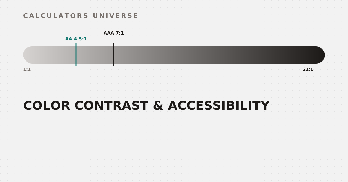
WCAG’s contrast ratio is (L1 + 0.05) / (L2 + 0.05), where L1 and L2 are the relative luminance of the lighter and darker colors. Relative luminance itself is a weighted, gamma-corrected sum: 0.2126×R + 0.7152×G + 0.0722×B — not a simple average, because the human eye perceives green as dramatically brighter than blue at equal RGB intensity. Each channel is gamma-corrected first (values ≤0.03928 divided by 12.92; otherwise raised through a power curve) before that weighting is applied. The result ranges from 1:1 (identical colors, no contrast at all) to 21:1 (pure black on pure white, maximum possible contrast). Calculate the exact ratio for any two colors — in HEX, RGB, or HSL — with the Color Contrast Checker.
The Actual Thresholds: AA vs AAA
Both thresholds drop for large text: AA needs only 3:1, AAA needs only 4.5:1
Level AA — the standard most sites target — requires 4.5:1 for normal text and 3:1 for large text (18pt or larger, or 14pt bold). Level AAA — a stricter standard — requires 7:1 for normal text and 4.5:1 for large text. Get an instant pass/fail verdict for both levels, and both text sizes, with the Color Contrast Checker.
Contrast Alone Isn’t Enough: Color Blindness
Tritanopia (blue-yellow) is genuinely rare — red-green deficiencies dominate
Passing WCAG’s contrast formula only guarantees luminance difference — it says nothing about whether two colors are distinguishable by hue alone. A design that relies on “red means error, green means success” can be functionally invisible-as-different to a real, sizable share of users: deuteranomaly (a malfunctioning green cone) is the single most common form at 2.32% of the population, followed by full deuteranopia (0.64%), protanomaly (0.54%), and full protanopia (0.51%) — combining to affect roughly 8% of men and 0.5% of women of Northern European descent. Tritanopia (blue-yellow deficiency) is comparatively rare, at just 0.01%. Preview any color or palette under protanopia, deuteranopia, tritanopia, and grayscale simulation with the Color Blindness Simulator.
Designing Palettes That Actually Work
A visually pleasing color scheme still needs both checks applied afterward — harmony alone doesn’t guarantee accessibility. Generate complementary, analogous, triadic, or monochromatic palettes from any seed color with the Color Palette Generator, and pick individual colors while checking accessible text contrast directly with the HEX / RGB / HSL Color Picker.
Converting Between Formats Correctly
Because the WCAG formula operates specifically on RGB channel values, getting format conversion right matters before you can even calculate a contrast ratio. Convert between HEX, RGB, HSL, and CMYK — with contrast ratios included — using the HEX to RGB Converter and Color Code Converter.
Frequently Asked Questions
What’s the actual WCAG contrast ratio formula?
(L1 + 0.05) / (L2 + 0.05), where L1 and L2 are the relative luminances of the lighter and darker colors — a weighted, gamma-corrected combination of the RGB channels, not a simple visual comparison.
What’s the difference between AA and AAA compliance?
AA requires 4.5:1 contrast for normal text and 3:1 for large text; AAA is stricter, requiring 7:1 for normal text and 4.5:1 for large text.
Why can’t I just use “looks different enough” for color choices?
Because human perception of contrast varies, and more importantly, a real share of users have color vision deficiencies that can make hue-based distinctions (like red vs. green) invisible even when luminance contrast is technically adequate.
How common is color blindness really?
Combined red-green deficiencies affect roughly 8% of men and 0.5% of women of Northern European descent, with deuteranomaly (a malfunctioning green cone) being the single most common type at about 2.32% of the population.
Does high contrast alone guarantee accessibility?
No — contrast ratio addresses luminance difference specifically. Color choices also need to be checked against color vision deficiencies separately, since two colors can pass a contrast check while still being indistinguishable by hue to some users.
Related Calculators
Start with the Color Contrast Checker for WCAG AA/AAA verdicts, and the Color Blindness Simulator to catch hue-only distinctions. Build and pick colors with the Color Palette Generator and HEX / RGB / HSL Color Picker, and convert formats correctly with the HEX to RGB Converter and Color Code Converter.
External Resources
- G18: Ensuring a contrast ratio of at least 4.5:1 — W3C — the official W3C technique defining the WCAG AA contrast threshold
- Color blindness — Wikipedia — background on types and prevalence of color vision deficiency